The Finnish Association of Architects SAFA
Finland has a rich architectural heritage, and the Finnish Association of Architects (SAFA) plays a key role in preserving and advancing this legacy. The challenge was to create a rebrand that honored SAFA’s long history while ensuring its relevance for today and the future.
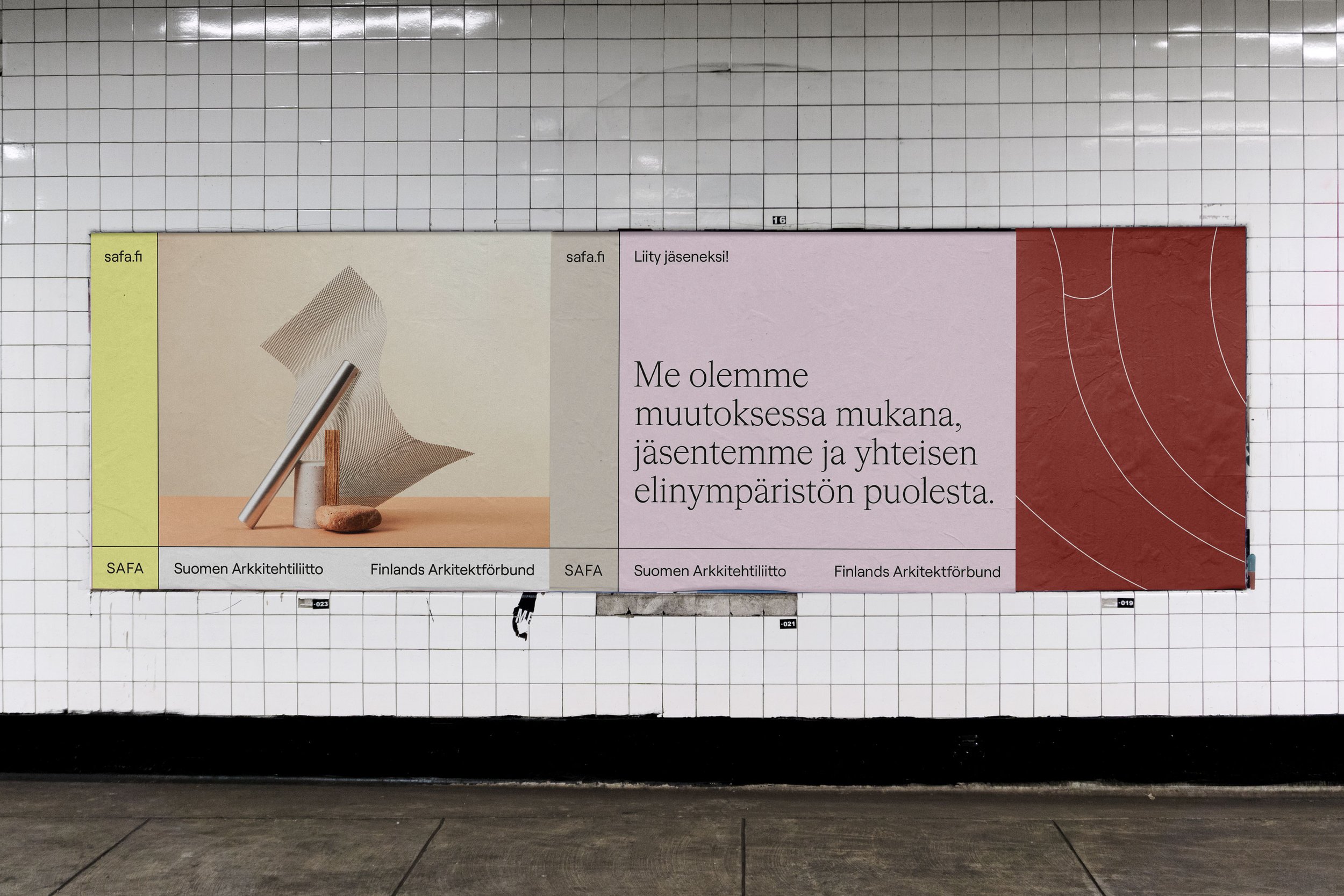
The new visual identity draws inspiration from SAFA’s original emblem – the acanthus leaf designed by renowned Finnish architect Alvar Aalto. This symbol was reinterpreted into abstract graphic patterns, paying homage to the association’s heritage while introducing a fresh, contemporary aesthetic. A vibrant color palette further revitalizes the brand, striking a balance between tradition and modernity.
A grid-based system, reminiscent of architectural blueprints, unifies the identity and creates a structured, cohesive visual language.
Typography plays a key role in bridging past and present: the geometric Roobert typeface provides a clean, modern foundation, while the calligraphic nuances of Cigars nod to SAFA’s history. The refined logotype is paired with brand imagery inspired by architectural forms and material interplay, reinforcing SAFA’s deep connection to the built environment.
Client
SAFA
art Direction
Sofia Pusa
Photography
Atte Tanner
Design
Sofia Pusa
Set Design
Jenni Juurinen