Shared Space
The Shared Space exhibition at Helsinki Art Museum features site-specific works across Helsinki, exploring themes of coexistence, place, and layered meanings in urban life in the art works. The challenge was to design a visual identity that balanced clarity with poetry, effectively illustrating how the artworks are distributed throughout the city while reinforcing the exhibition’s themes.
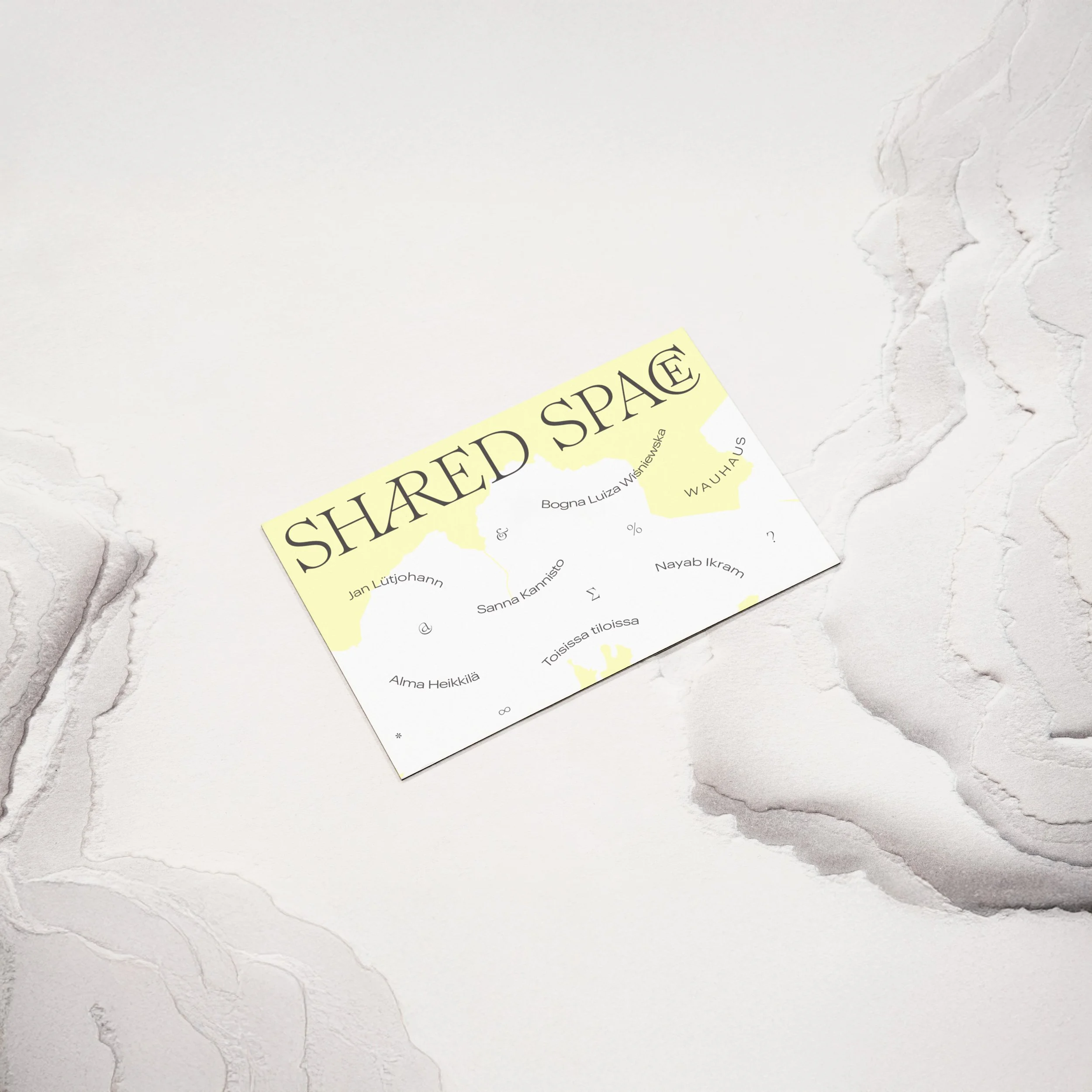
Helsinki Art Museum’s vision was to integrate the Helsinki map as a key element of the identity, visually linking the exhibition’s dispersed locations. This concept was brought to life through typography and layout choices that reflected movement, connection, and shared experience.
The logo embodies the idea of coexistence through the unique typographic ligatures in the Romie typeface, creating a sense of interwoven relationships. The use of all-caps reinforces the theme of equality, a central focus of the exhibition. In layouts, artist names were arranged to resemble map pathways, symbolizing the interconnectedness of urban life and human experiences. Typographic glyphs functioned both as location markers and as abstract symbols of communication and layered meaning within the artworks.
A bold yet soft color palette of pink and light yellow introduced warmth and presence, creating a sense of care while allowing flexibility across various touchpoints. The final identity seamlessly ties together the exhibition’s thematic depth with an intuitive, map-inspired system, making the concept of shared space both visible and tangible.
Client
Helsinki Art Museum HAM
Creative Direction
Sofia Pusa
Design
Sofia Pusa


